Case Study: Iconography of Race to Adventure


Click the images above to embiggenate! We're wrapping up the final design for the cards in Race to Adventure. You can see a sneak peek at an early draft in this earlier post. I want to give you a light overview of some of the process.

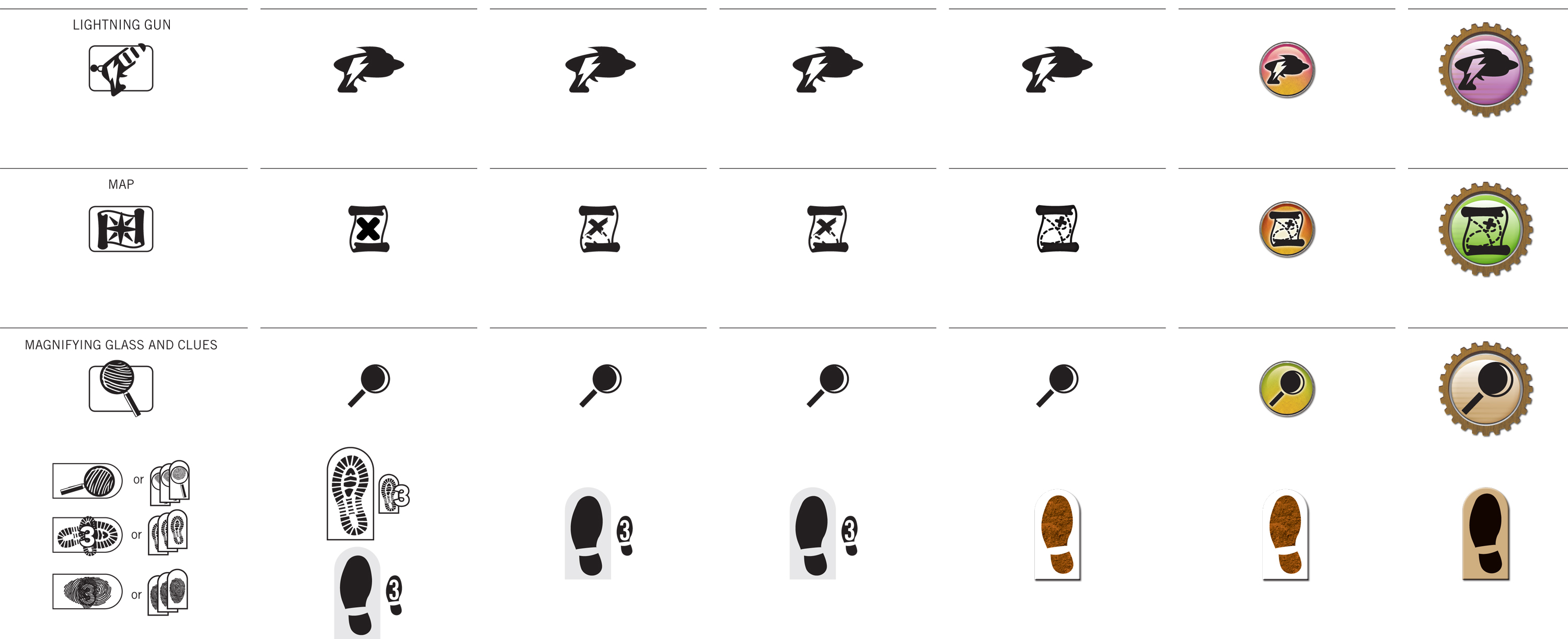
At the top of this post, you can see how the icon language evolved over several rounds. The images from that last post were from around Round 4 or 5. Since then, we got some really useful input from the gamma test team. They're all avid Euro board game players. Since there are long-term international hopes for this game, we wanted a global perspective.

Mostly the direction was to err on the side of minimalism and simplicity, like a Euro or German game. In Euro terms, this seemed to mean no high-texture or three-dimensional rendering anywhere near the icons. We went back and forth on that point for a while. We settled on the side of three-dimensionality, with some constraints. The essential silhouettes of the icons are still clearly visible, but also use color-coding sampled from the actual item card art.

Visualizing movement was another troublesome matter. The biplane moves one space in a cardinal direction, then another space in a cardinal direction. Then, all other players may move one cardinal direction. The earliest rounds were very literal, showing a full spread of potential movement with lines arrayed from a central pawn. When movement could cross borders, as with the jetpack, we literally showed a border around the pawn.

Clearly this becomes problematic in the confined real estate of the average playing card. In each iteration, we became less and less literal for the sake of space constraints and distance-reading. Instead of showing an example playing field, we simply use icons to represent each type of movement. We now use cardinal arrows to communicate each cardinal movement. Those arrows rotate 45º to indicate diagonal movement. When movement can cross borders, we use a separate icon for that.

Thus, you can see how the "words" of this visual language are born. Two orthogonal crossed arrows translate to "Two movements, each in a cardinal direction." The basic syntax filtered out into the rest of the game, too. It was a great experience working with a robust gamma testing process. Definitely looking forward to working on more card games in the future!
P.S. As an added bonus, here's the Pinterest board I pulled together for inspiration way back when the project first began.


Lookin' snazzy! It's also really cool to see the evolution. I really love behind-the-scenes documentary stuff, showing the way creators create. I find it interesting and educational.
ReplyDelete